Personal E-Factor™
What is Personal E-Factor™ Exercise?
This is a set of six pages.
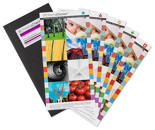
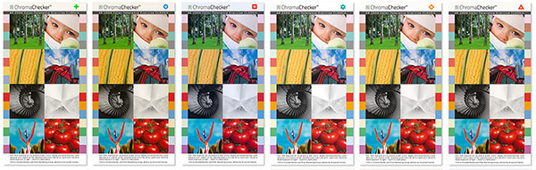
Each page is marked with one of the icons: ![]()
![]()
![]()
![]()
![]()
![]()
are created so selected pairs shows specific values of ∆E 2000
(90% samples – individual pixels of the images and patches, manufactured with the average accuracy = 0.5 ∆E)
The ChromaChecker™ Personal E-Factor™ Exercise is designed to be a fast, simple, accurate way to correlate a persons ability to visually judge an acceptable color match with a standard, known, numeric standard to determine color difference called ∆E (delta E) (00). This exercise is process agnostic, it relates to Large Format, Digital Printing, Flexography and Conventional Sheetfed and Web offset printing processes.
Today a Print Organization has two main ways to differentiate themselves from competitors, first- by Price (meaning commodity product) or Secondly by Quality- but how do you quantify QUALITY? Now with TR016 (Technical Reference) referred to in CGATS21, Print Organizations have the ability to differentiate themselves based on Quality! If you want to perform work for demanding customers that request an audit, or prints to prove a printers precision and accuracy, then this exercise is required to educate your customers about color difference and why your company can ask for a premium price because your precision and accuracy is better then other, lower quality, (commodity) print organizations.
It is designed to be a stand alone exercise, capable of being taken by an individual, department or company at any time. The person taking the exercise does not have to know anything about color except knowing what is an acceptable match for them, or when used with a group, when the group decides based on consensus.
This exercise is designed for any company involved in reproducing color. It is required for any company looking to implement process control procedures, calibration and or Color Profiling tools. Everybody has a different view of what is an acceptable color match. Up until now, it has been very hard to quantify this value. The only real way to determine what a persons tolerance was a lot of trial and error experiences, which can be frustrating and lead to unattainable expectations, and if multiple people are involved, inconsistent results.
Part of CGATS21 references TR 016 for Printing Tolerancing and Conformance Assessment. This Document references four levels of Color Tolerancing as a way to differentiate a companies business by qualifying color quality.
Printed (hard copy) version vs. on-line Exercise
On-line tool limitation: A working space is set to sRGB - as it is default color space for most web browsers. All pictures are finally converted to this space. Some color deviation - especially when ∆E has high value is out of sRGB gamut. Therefore, some pixels may be not displayed correctly. Another limitation is caused by monitor's ability to accurately render pictures in sRGB. Therefore why on-line version doesn't,t replace printed version. It is also important to remember that perception of the on-screen displayed picture (emission of light) differs to the perception of reflected light (when printed on the substrate and lighten with given source of light).
Start the Exercise:
In order to determine your color tolerance, the colors on the pages of this exercise were built to display the given delta E (00) differences under a D50 Illuminant. Ideally this viewing environment should be a certified color viewing booth with proper light bulbs. Look at the Purple Rhem indicator on the outside of the Delta E Exercise envelope. This patch should show on continuous color, there should be no stripes visible. If stripes are visible, light is not correct, and ChromaChecker™ Personal E-Factor™ Exercise should not be conducted until the lighting is corrected. If a suitable light booth cannot be used, as a last resort move to a non-tinted window to assess if the stripes disappear. If the stripes disappear, perform the exercise in this environment.
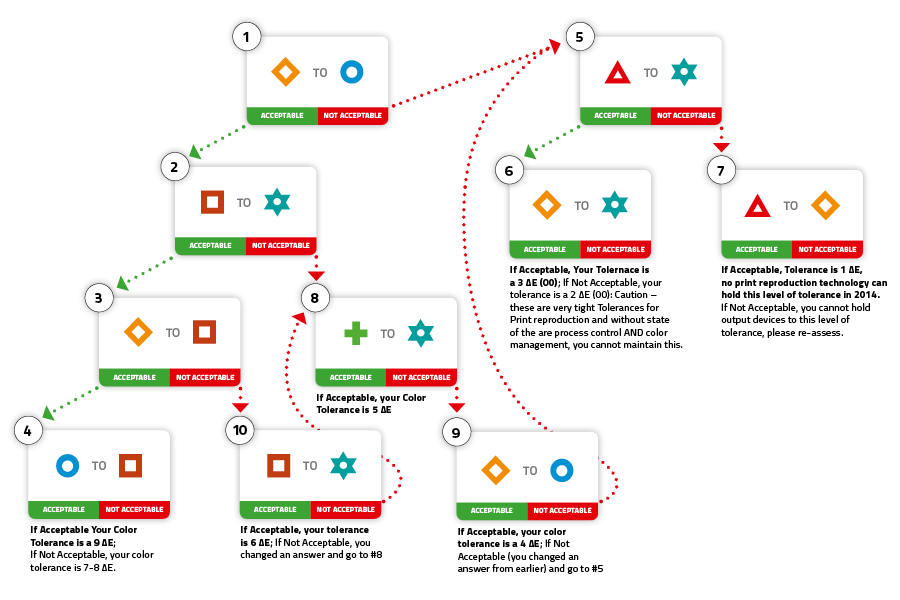
How to Interpret the Results:
The amount of perceived color difference (results of this exercise) needs to be compared with the actual color differences of the devices being used. You will be surprised how different the color of your devices are to one another- it will generally be more then the number your chose in the exercise. You will want to use color targets and comparison software to actually verify how consistent your devices are to themselves over a given page and over time as well as compared to your targeted device.
As with any Quality control project, you do not want to set your tolerance too tight; if you cannot achieve the desired results you will give up the project. Be conservative, evaluate your devices, if they are 5 ∆E Peak of difference, then set your tolerance at least 5 if not 6 ∆E of tolerance. Over time you will learn what variables are affecting your color consistency and will be able to address them one at a time and as you do you will watch your ∆E come down to your goal.
Below is a listing of different ∆E values based on your number from the derived exercise. We have attempted to outline what the different tolerances mean from a graphic Arts perspective. The references are to Peak ∆E.
CRF (95%)
A typical print process can have variation, and it is important to understand what metric to use when assessing your variation. Average ∆E is often too ambiguous, and Peak is too extreme. CRF represents the 95% percentile of the ∆E, which means if you have 100 colors in your comparison and stack rank the difference based on ∆E, the Peak difference would be the largest difference in all 100 samples, the CRF is the 95th largest difference which allows for some natural variation in most print processes.
What are designed differences?
∆E = 1 |
||
∆E = 2 |
||
∆E = 3 |
||
∆E = 4 |
||
∆E = 5 |
||
∆E = 6 |
||
∆E = 7 |
||
∆E = 9 |
TR-016 Color Tolerance Exercise equivalents:
![]() Master |
Master | ![]() Level A –Yellow |
Level A –Yellow | ![]() Level B – Yellow |
Level B – Yellow | ![]() Level C – Yellow |
Level C – Yellow | ![]() Level D – Yellow |
Level D – Yellow | ![]() Level D – Blue
Level D – Blue

