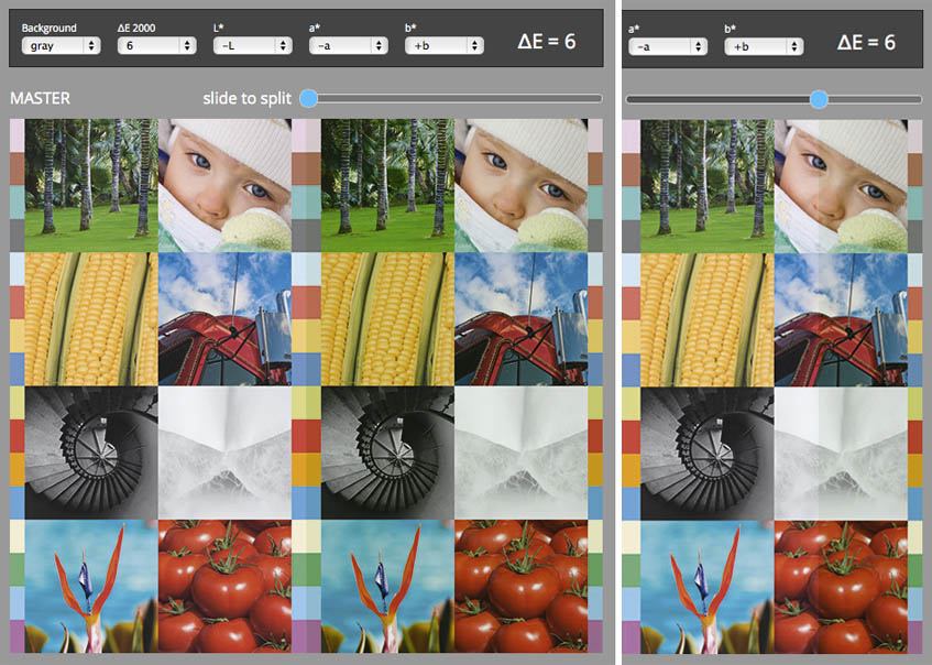
This tool shows original master picture and its copy transformed so that color difference for more then 90% pixels differs from master with given ∆E2000 value.
The goal is to visualize color difference and in that way relate personal perception with numbers.
It is critical to understand that perception of color difference depends on several factors. Changes in L* only produces in most cases stronger feeling than if only hue or saturation are modified. Human perception is different for reds and greens. Generally speaking, it is very important to understand that acceptable tolerance depends on a type of image. More saturated, vivid colors are percept another then neutrals. In flat colors we can see much more than in colorful pictures with many local contrasts. Cultural background makes us more sensitive to the color of the human body (skin tones) as to other colors. Also, the environment has a strong impact - here are important colors in the neighborhood.
This tool can simulates 26 different image variations for each selected ∆E tolerance.
In some cases with small ∆E value it is hard to see a difference. To make it more visible a slider dynamically splits the picture into master and modified part. See screenshot below:
Enter tool
Tool limitation:
A working space is set to sRGB - as it is default color space for most web browsers. All pictures are finally converted to this space. Some color deviation - especially when ∆E has high value is out of sRGB gamut. Therefore, some pixels may be not displayed correctly. Another limitation is caused by monitor's ability to accurately render pictures in sRGB.
We advice to use another ChromaChecker Tool: Web Browser Tester.