Options for setting exacting Tolerances
Attempting to define an acceptable tolerance (deviation) from the desired reference is a difficult process because color is not linear and it is very subjective. The first reaction is to define a tolerance by declaring a certain ∆E, but as good as ∆E (00) is, there are many colors where ∆E does not sufficiently qualify the deviation in all color directions. ChromaChecker has a tool called Spot Color Variator (Provide a link to show) which visually shows the problem related to defining an ∆E (2000) tolerance scheme to colors. Some ∆E values related to colors react worse than others due to the nonlinearity of color and where the color is in the color space. To overcome this limitation, ChromaChecker has introduced the Snowflake Tool. The Snowflake tool allows a user to define the acceptable color tolerance in each color axis independent of one another (essentially 3 times more accurate than ∆E (00)), and can help determine if your print process is capable of achieving this level of tolerance.
There are situations in printing production when the traditional tolerance description system fails. The value of the accepted error expressed by the ∆E formula for some colors seems to be mismatched and it works both ways, some differences are too big, and others may have been smaller. Very often we have a situation when observing what the boundary values look like for a given tolerance value, most often, especially for fairly saturated colors, the change of tone determined by the a and b axes is more acceptable than the change of brightness (L axis). It also happens that we are willing to accept slightly larger deviations for the b axis than for the a-axis. This is because the b axis corresponds to the color temperature - and this is the subject of the compensation that our brain performs when the white color changes with the times of the day. Chromatic adaptation has taught us to understand subconsciously the swing between yellow and blue. Man, his brain interprets changes on the green/magenta axis differently. Here the brain pays completely different attention to the swing of color which it tries to read other meanings culturally inscribed in our system of interpretation. When we see a greenish or magenta color on the face, it is a sign of a disease for the brain - we are sensitive to such a signal. Similarly, our ability to interpret such colors on food - is a subconscious warning that what we are looking at is potentially poisonous, and unhealthy for us. Memory colors, which are the basis of the ability to remember a color, have some kind of internal tolerance mechanisms assigned by nature.
When ∆E is not good enough, generate Snowflake
Color consistency is critical for building a strong brand; the tolerance needs to take into consideration two variables, first, it defines the level of perceived acceptable deviation from reference, and secondly, it should be verified to ensure it can be reproduced in the print/manufacturing process, not all print processes are capable of rendering color to the desired tolerance. The Snowflake allows the user to define the acceptable level of deviation from the reference color. The Snowflake provides a three-dimensional comparison of the reference for each axis independently, separately for larger values, and separately for smaller ones. The Snowflake accurately reproduces (on the screen or on print) the color deviations and allows the user to determine the allowable tolerance conditions for each of the six-axis.
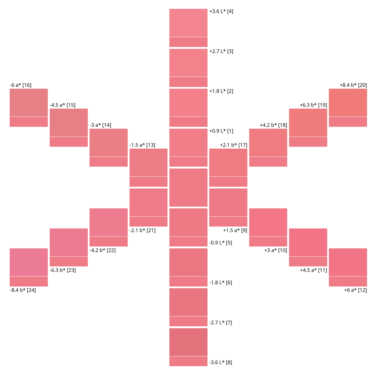
Please notice that the steps on each axis id are different, but the visual results are similar
Printing of Snowflake would appear to be simple, but ensuring the result is accurate is very demanding. In order to create a printed result to be trusted for a visual decision, it is required to display and/or print this Snowflake very accurately. ChromaChecker offers a couple of procedures that make this possible:
1. Display first - it saves time and consumables!
2. Print Snowflake
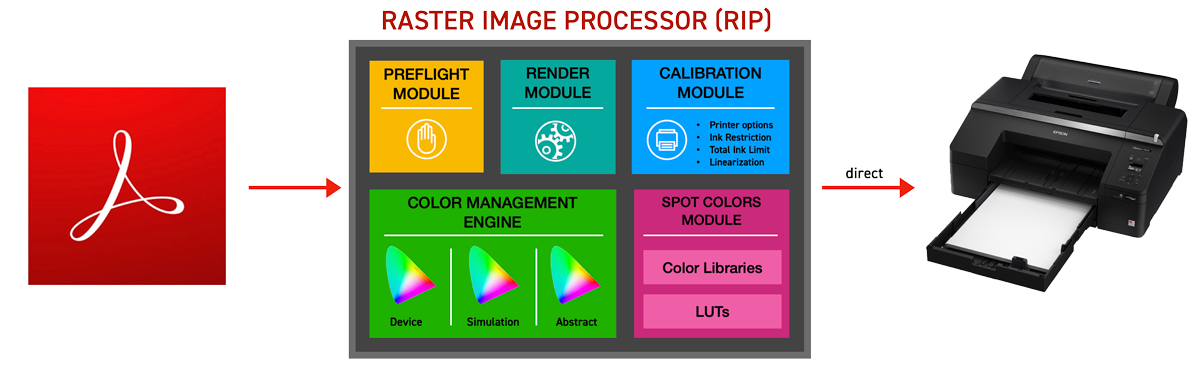
Although not as fast and easy as displaying your Snowflake on an accurate soft proofed display, it is possible to print your Snowflakes on your calibrated and qualified printing device. It is important to understand how to utilize the Snowflake print options for your given print workflow to produce accurate results. In most cases, your printer should be able to print values addressed by various color spaces ( Lab, CMYK, RGB...). No matter what your printer workflow is, basic rules stay the same:
Creating a Device ICC Profile for your printing device is the KEY to success
Optimizing your ICC Profile- an abstract profile-based solution.
Take advantage of ICC Profiling iterations based on multiple printouts. Some RIPs can iterate and optimize and find the optimum accurate abstract profile as part of the RIP workflow. (EFI, CGS-Oris, GMG, and others have this capability)
Iterate Spot Color LUTs (Lookup tables)
ChromaChecker has a tool called Virtual Spot Print which helps to define specific RGB or CMYK color formulas for printing "named" spot colors. The solution requires the RIP to support a named color workflow which allows the named color to be substituted for specific CMYK or RGB device definitions in the PDF. ChromaChecker Color Inspector tool provides for Spot color LUTs which can be used to find better CMYK or RGB color definitions based on what the print actually rendered. ChromaChecker Capture measures the results and compares them to reference and if necessary, will iterate the CMYK or RGB definition in an attempt to create a more accurate color definition for the printing device, and create a new Spot color LUT for the printing device.
The Snowflake Target is not defined using spot/named colors and is NOT compatible with this process.
Find the closest color on your printer by using the Color Grid tool
Entering tolerance values in the system
Exporting Advanced tolerances to your X-Rite eXact
Once you enter tolerances in the system you may export your library to a CxF file format that supports the extended definition. The user may select a file format that fully transfers tolerances to eXact internal memory. Learn more about how to set this feature in Color Inspector.
Palettes and Libraries - how to use different tolerances for different tasks?
Color Inspector supports a multi-level structure for naming which supports having the same reference color defined for multiple print conditions. This allows for defining different references based on the substrate being used in production, for instance, if rendering Coke red for a label on a bright white stock should result in a close match to the absolute Coke red definition (defined in the Library), but when rendering the same Coke red on a Recycled consumer board stock, the reference will have to be different to accommodate the fact that the substrate will not allow ink to match the absolute reference, so a secondary (producible) reference (defined in a color palette for recycled stock) has to be defined to accommodate the lower quality substrate.
If you have specific color libraries (like Pantone or other) and different customers have different tolerances, ChromaChecker allows you to make copies of the libraries as customer-specific palettes each with different tolerances to accommodate each customer's needs. When applying the palette definition within Print Inspector, the user can assign both the specific Library and Palette to one track. ChromaChecker default sets the higher priority to the palette definition and will override tolerances of the same sample from the Library.
Related Topics
Contact ChromaChecker Support
Additional information and Support Form is available for logged users.